
Blog
Mobile Cart UX for PrestaShop: 7 Patterns That Actually Convert
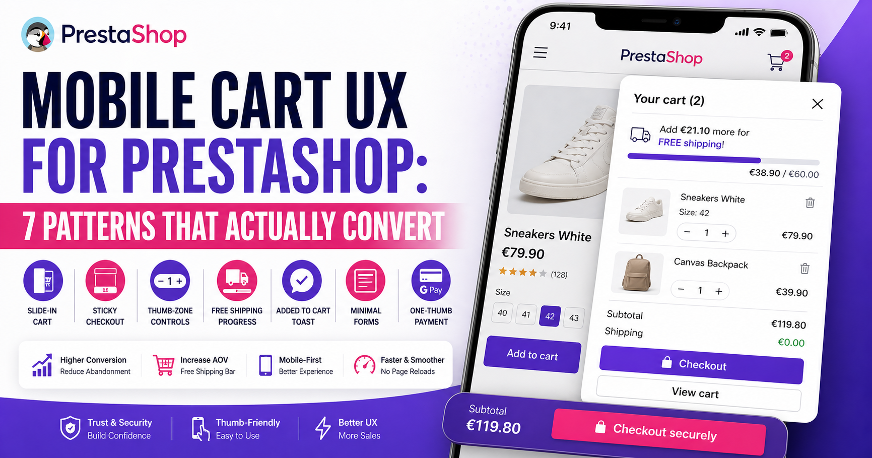
Mobile traffic now accounts for 70-78% of visits to most PrestaShop stores but only 35-45% of completed orders. The gap is where mobile cart UX fails. Desktop-first cart patterns — full-width tables, tiny quantity controls, redirect-to-cart flows — all punish thumbs and slow connections.
Here are the seven patterns that reliably convert better on mobile in PrestaShop stores, what each one replaces, and when to use which.
Why mobile cart UX is a different problem
The structural constraints of mobile shopping:
- Thumb reach zone — only the bottom third of the screen is comfortable. Quantity controls placed at the top of a cart row are awkward.
- Cognitive load — mobile shoppers are commonly distracted; attention windows are shorter. Full page reloads break the flow.
- Connection variability — 4G/5G inside buildings is unpredictable. Every page load is a retry risk.
- Screen dimensions — a 390px-wide viewport has no room for the default PrestaShop cart table layout.
Cart abandonment on mobile runs 10-20 points higher than desktop. For the full picture, see the PrestaShop cart abandonment guide.
Pattern 1 — Slide-in cart panel instead of cart page redirect
Default PrestaShop flow on mobile: tap “Add to cart” → whole page replaces with a cart table → tap “Continue shopping” or “Proceed”. Three loads, two context switches, massive cart abandonment.
The fix: a slide-in panel that appears over the product page, shows what was added, offers a “View cart” and “Checkout” CTA, and closes with a tap outside or a swipe. The user never leaves the product they were considering.
Expected impact: 8-15% improvement in completion rate, concentrated on mobile. See also AJAX cart vs page reload for the technical comparison.
Pattern 2 — Sticky bottom checkout CTA
In a long cart on a narrow screen, the primary “Checkout” button disappears as the user scrolls items. They forget it’s there. A sticky bottom bar that shows subtotal and a single “Checkout” button fixes this.
Implementation: position:fixed at bottom, 56-64px tall, full width, one button (not three). Hide it when a modal is open. Keep it visible even with keyboard open on iOS (harder than it sounds — requires viewport-fit=cover and safe-area-inset-bottom).
Expected impact: 3-6% on mobile completion.
Pattern 3 — Thumb-zone quantity controls
The default “qty -[ ]+ ✕” pattern works fine on desktop. On mobile it’s tiny, the tap targets overlap, and removing an item accidentally is common. Redesign for mobile:
- Minimum 44×44px tap targets (Apple HIG minimum; Material Design recommends 48dp)
- “-” and “+” buttons physically separated, not adjacent
- “Remove” as a discreet secondary action (small “×” in the top right of the row, or swipe-to-remove)
- Visual feedback on tap (brief color change, not just state)
Expected impact: 1-3% on cart modification success rate — small but compounding.
Pattern 4 — Free-shipping progress bar
Free shipping is the single most-requested incentive in ecommerce surveys (58% of shoppers cite it as their #1 reason to buy more). But customers don’t know the threshold exists if you don’t show it.
The pattern: a persistent progress bar at the top of the cart that says “Add €12 more for free shipping” and fills as items are added. On the product page, the same bar shows what the threshold is before they’ve added anything.
Expected impact: 6-15% increase in AOV (Average Order Value), plus reduced abandonment because shipping cost is no longer a surprise.
Pattern 5 — Single-tap “added to cart” confirmation
Most stock PrestaShop themes fire a modal popup on add-to-cart: “This product has been added to your cart. [Continue] [Checkout]”. On mobile, the modal covers the screen, requires a decision, and breaks flow.
Better pattern: a toast notification — a small banner sliding in from the top or bottom for 2-3 seconds saying “Added to cart ✓” with a small “View cart” link. It acknowledges the action without demanding one.
Expected impact: 2-4% reduction in abandonment at add-to-cart — small, but stacks with other fixes.
Pattern 6 — Minimal checkout form on mobile
The default PrestaShop checkout has many fields that aren’t strictly required. Mobile users abandon aggressively when the form feels endless.
Audit ruthlessly:
- Do you really need phone number? (Most EU shops don’t — remove)
- Do you need a second address line for most orders? (No — collapse to optional)
- Can company name be optional? (Yes — optional)
- Use browser autofill properly with
autocomplete="postal-code",autocomplete="given-name"etc. - Use
inputmode="numeric"on postal code and phone so mobile keyboards switch to numbers
Expected impact: 3-8% fewer form abandonments.
Pattern 7 — One-thumb payment flow
Payment form is the highest-abandonment screen in the funnel. Mobile-specific fixes:
- Apple Pay / Google Pay buttons above the credit card form — one tap, biometric auth, no typing.
- Number-only keyboard on card fields (
inputmode="numeric"). - Auto-advance between card number, expiry, CVC fields.
- Payment provider logos right next to the CVC field (reduces “is this safe?” anxiety).
- Remove anything that isn’t the payment itself from this screen — no upsells, no newsletter signup.
Expected impact on mobile: 5-12% on final-step conversion. Apple Pay alone on an iOS-heavy store can add 10-20% to iPhone conversion.
How to measure mobile cart UX success
Segment every metric you track by device:
- Mobile add-to-cart rate vs desktop (should be close, often isn’t)
- Mobile cart-to-checkout rate — where most stores leak
- Mobile checkout-to-purchase rate — second biggest leak
- Mobile rage-click / dead-click via Microsoft Clarity (free) — reveals UX problems you can’t see in numbers
- Time-on-cart-page — too long usually means struggling, not engagement
Record 20-30 mobile sessions using Clarity or Hotjar before you start optimizing. You’ll find two or three specific friction points that weren’t on anyone’s shortlist. That data is worth more than any checklist.
Frequently asked questions
What’s the most impactful single mobile cart change for PrestaShop?
Replacing the redirect-to-cart flow with a slide-in panel. It addresses multiple abandonment causes at once: context switch, scroll reset, interruption, cognitive load. Same pattern as successful mobile commerce apps.
Do I need a separate mobile theme?
No. A responsive theme with mobile-first CSS is standard. Separate mobile themes (m.yourdomain.com) are legacy and hurt SEO. Work within your main theme and override with media queries for mobile-specific tweaks.
Does Apple Pay / Google Pay integration work on PrestaShop?
Yes, if your payment gateway supports it. Stripe for PrestaShop, Mollie, PayPlug, and PayPro all support Apple/Google Pay out of the box in 2026. The gateway module handles the button and payment sheet automatically.
Are sliding carts bad for SEO?
No. A slide-in cart is UI; it doesn’t affect how Google crawls your product or category pages. See AJAX cart vs page reload for why this myth persists and why it’s wrong.
How do I test if my cart actually works on real mobile devices?
Chrome DevTools device emulation is unreliable for real touch/network behavior. Use:
- Your own phone (not the emulator)
- A slow connection throttled to 3G in DevTools for repeat testing
- BrowserStack or LambdaTest for iOS Safari, Samsung Internet, real hardware
- Microsoft Clarity session replays from actual customer devices
Quick starting point
Three-week plan: Week 1 — replace redirect-to-cart with slide-in panel (biggest impact). Week 2 — add free-shipping progress bar. Week 3 — audit and trim checkout form fields. Measure each week before moving to the next.
If you’re implementing the slide-in pattern, Sliding Cart Block ships with it plus the free-shipping bar and cross-sell patterns covered here, compatible with PrestaShop 1.7 and 8.x.